🧩 Modules
Tabular display
New “Calculate” function
- This function allows the user to display the sum, maximum value, average, highest or lowest value for columns with numbers (e.g., product prices)
- For non-numeric values, it shows, for example, the percentage of filled fields, the percentage of unique records, or whether checkboxes are checked or not
New and better “Conditional colouring” function
- Tables now have a coloring function: the user can now highlight essential rows according to the selected parameters (e.g., the user can find duplicates for all columns)
- Added a “reset” button to cancel the coloring selection

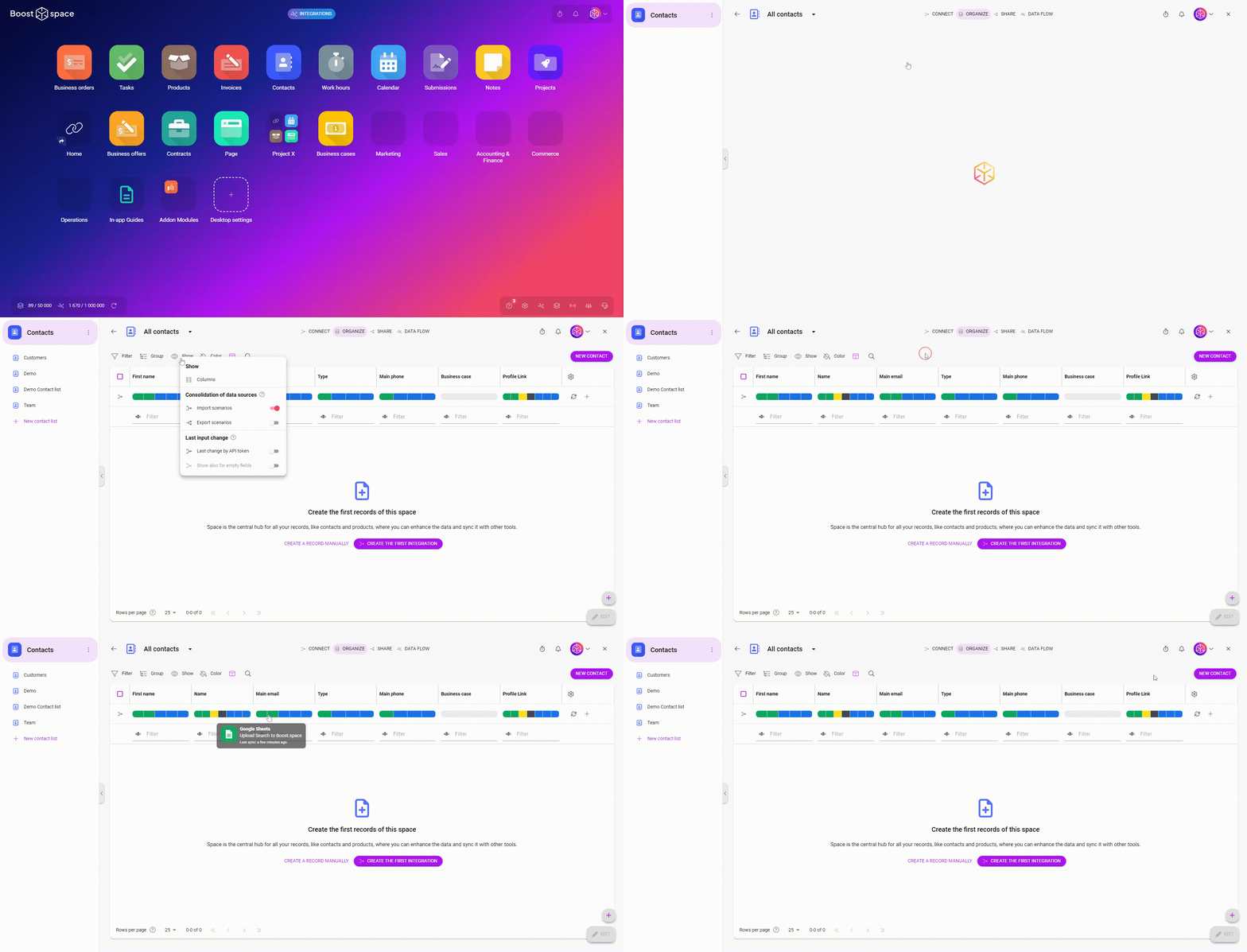
Added a “view” button
- Under this button the user now has the possibility to set the columns in the table, consolidate data or the last changes made to the field by the API token
- As part of this, the filter icons have also been unified across modules
Notes
- Fixed the absence of a button for bulk actions in the table view within the Notes module
Stock requirements
- New closing of a reservation after switching to “Archived” status
- Fixed rounding below the table in Stock requests
- “Archived” status is now also applied to Purchases
- The “Specifications” column from the Stock card can now be displayed in the Stock request
- Enabled user to stock only a partial count from a Stock request
Main and subordinate spacing
- Added distinction whether it is a master or slave space when creating e.g. a task, adding a new product, business opportunity, or order
Forms
- Added information in which space the form response was created
- The form response now includes a link to the related form
🔗 Integrations
- Improved message informing the user that it’s not possible to set a given key column when there are existing duplicates (at the point where the user sets a key column for a given space) – these duplicates are highlighted by the “Conditional coloring” feature in the “Organize” table
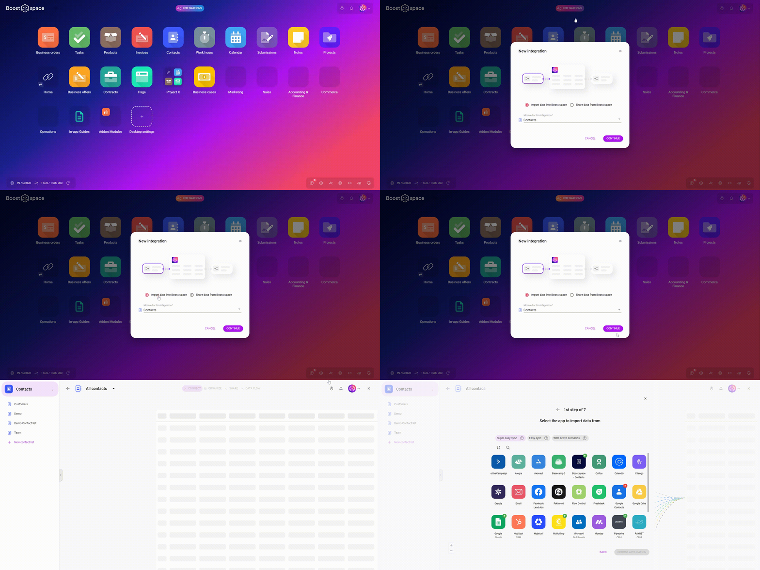
- Added animations with cubes for pre-made templates when creating data integration from Boost.space or vice versa
- When selecting templates for integrations, users will now be suggested custom field groups
- Hiding applications in “Share” scenarios – “Super easy integration”
Creating integrations
- In the step of choosing an API token and selecting the option to set it manually, added recommended accesses and permissions for the modules

Integration flow
- Applications in creating integrations are now smaller
- Added animated cubes for integration templates
- Simplified step for selecting an API token
Changes to the main desktop
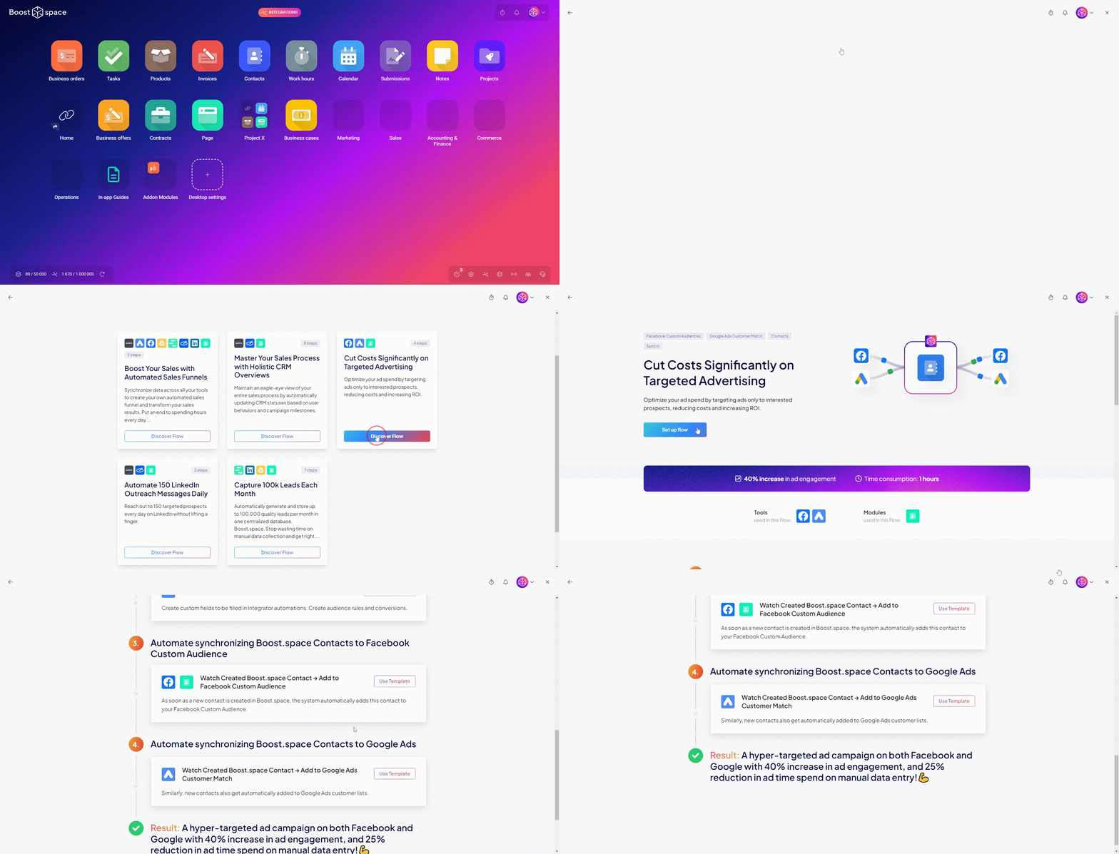
- There is a new possibility to use our pre-made “use cases” when creating integrations
- When a user clicks on a chosen use case, it takes them to the module to the “Connect” or “Share” step to the pre-selected scenario
- On the main desktop, the button with the use cases is located in the bottom right corner after clicking on “Integrations”
- Use cases can also be explored from the web, where the user can find the button at the top of the screen

⚙️ System & Settings
Custom fields
- Possibility to add additional fields for system groups of custom fields in all modules
Main area
- Added “Integrations – legacy” button under the integrations icon in the bottom right corner of the main desktop, which, when clicked, opens a page with active integrations
- Added a button to the main desktop at the top of the screen to book a 30-minute call (visible to system admins) to give users tips for using the Boost.space application even more effectively
- Added an “Integrations” button to the top of the main desktop that opens a menu for the user to create a new integration, set up an API token, show active integrations, open the integrator, or view the use cases offered
Setting up the system – Welcome flow
- Added the possibility to set up an API token needed for the integrator
- The user can now verify their email in the Welcome flow

