🧩 Modules
Projects Module Just Got a Boost
We’ve enhanced the Projects module with smoother layouts and fresh icons for a more intuitive experience.
- If a user doesn’t select a specific project from the sidebar, we display a full list of projects. Plus, spaces within projects are now alphabetically ordered, giving you a more organized view.
- We’ve also adjusted menu item order and added a “New Space” icon to align visuals across modules. You can even customize icon colors for each project space, adding a personal touch.
- Attachment upload areas have been resized for quicker access.
- The “Description” section now appears only if you’ve entered content, keeping the interface clean.
Drag-and-Drop Flexibility for Orders and Offers modules
- We’ve added a drag-and-drop feature that lets you rearrange items in Offers and Orders with ease.
- Introduced an “Order Index” column, showing you a numerical order of the item
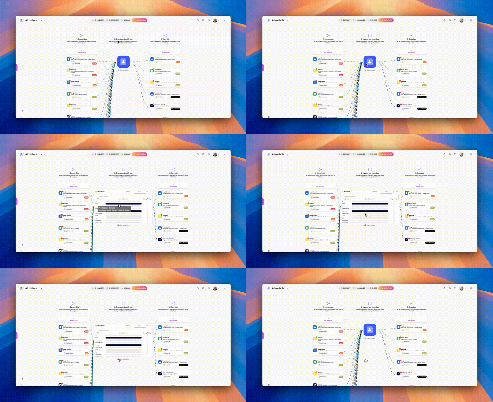
Sleek New Data Flow Visuals
We’ve reimagined the data flow visuals to make information clearer across modules.
- Now, the data consolidation table only appears if you enable it, keeping your workspace clutter-free.
- Improved responsiveness and user experience across displays for seamless interactions.

Smarter Table View
- The option to change “Records per Page” will only appear when there are more than 25 entries. If less, the option isn’t shown.
- Suppose a user is in a module without selecting a specific space. In that case, a tooltip appears in edit mode for unlinked custom fields, indicating that these fields can only be edited once their field and group are connected in the space settings.
- Required fields like “Contact List” or “Email” in new contact creation now display an asterisk, helping you easily spot mandatory fields.
Attachments Are Now Streamlined
We’ve revamped file displays in attachments across the system, making them more accessible and easier to read.
- Action icons are aligned side-by-side for better visibility, and we’ve added preview options for multiple file types, including .xls, .txt, and .ppt.
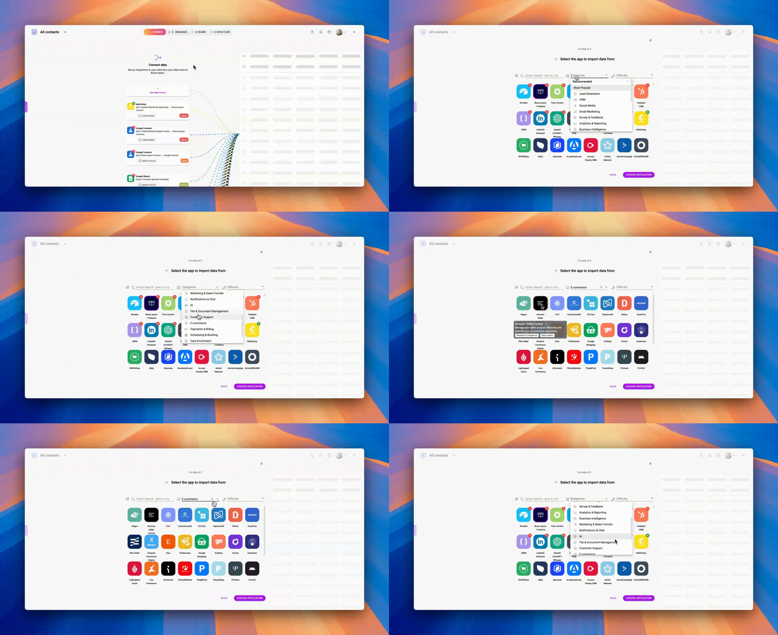
Elevated Integration Management with Integration Categories
- We’ve introduced categories in integration setup, grouping apps by type (e.g., Marketing, Customer Support) and complexity level.
- Hover over any app to see details and get direct links to the app’s website, putting everything you need at your fingertips.

Sharper Dashboard Visuals
- We’ve refined a chart display in the Dashboards module.
- Charts with many items now use scrollable pages for a clearer view.
⚙️ System
Upgrades in the System Settings
- We’ve added a new design option in system settings so you can update or reset your favicon.
- “About System” tab via which you can find a system version, read release notes, or clear cache data was added.
- To prevent issues, we’ve restricted system admins from accidental archiving themselves if they’re the only admin.
Polished Alignment Across System Fields
We’ve fixed alignment inconsistencies, ensuring a clean, uniform look throughout the system.
- The “Rating” field has been resized, and alignment for fields with numerous custom entries has been enhanced.
- Improved functionality for systems left open during sleep mode—now, your session resumes exactly where you left off, avoiding disruptions.
✨ Additional Minor Fixes and Improvements
- Custom Module: We fixed issues with conditional coloring in custom fields; edit mode now activates automatically after creating a record.
- Stock Items/Receipts: Archived stock items no longer appear in receipts and issues records.
- Label Editing: We resolved errors in label editing, so your selected labels display and save accurately.
- Firefox Browser Fix: We fixed a bug in Firefox that prevented input selection, ensuring smoother operations.
- System-wide Icon Update: We’ve introduced a new “All” icon.
- Orders: Removed the asterisk on the “Business Opportunity” field in orders, as it’s not a mandatory field.
- Table View Fixes:
- Resolved an issue where the “calculate” menu wouldn’t close after clicking outside the menu area.
- Fixed the display of added or removed labels for individual items in the table.
- Corrected an issue where label changes weren’t saved in the table’s contextual menu.
- Fixed tooltip display in edit mode for custom fields, ensuring tooltips appear on the question mark for each field rather than across rows.


