Not only does the cube shape appear in various forms in the brand, but it also represents the data and the Boost.space tool itself.

The cubes in the wireframe model show the path of the data and express the space in which it moves with ease and grace. As it does in our Boost.space 3.0 Integration Wizard. But we’ll talk about that one later on. The wireframe model shows that Boost.space wants its data to be coherent and make sense together. You’ll see small yellow blocks in our new visual language that float and combine to create a larger, solid cube: Boost.space.

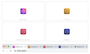
And let’s not forget the favicons, which are meant to make your life a little easier when it comes to navigating tabs and overall navigation throughout the system, docs, integrator and community. Now you can open them all at once and still easily find your way around.

Hang in there! Boost.space 3.0 is almost finished
Don’t worry, we haven’t forgotten about the update! We’re finishing the last parts and cleaning corners of the new Boost.space 3.0, and to tell you the truth, it will be even better than we expected. With more time we got to spend on it, the grander it got.
Get on the waiting list and be among the first to see it. A randomly selected group of those who sign up for the list will get the chance to try Boost.space 3.0 beta version, which we will release in the upcoming weeks.

We have a merch!
Although the blob will always remain in our hearts, we are ready to move on. But the real question is: Are you? Get on the waiting list!
